Improving a B2B Website Conversion
Closing the gap between users and a financial product by redesigning Fairplay’s acquisition and onboarding web experience.

Fairplay helps e-commerce businesses access the capital they need to grow — fast.
With more than 200+ active clients, 1B+ MXN invested, and strong retention (80%) and satisfaction (87%), the product was solid — but new users still struggled to understand how it worked.
My work focused on redesigning the online digital experience to better communicate Fairplay’s purpose, improve acquisition by reducing friction for prospects, clarify the value proposition, and build trust with prospects from the very first touchpoint through a product-led growth strategy.
Challenges
Seasonality
E-commerce businesses grow organically, but they depend heavily on peak sales seasons. Users needed financing urgently — and the product wasn’t clearly communicating how Fairplay supported rapid scaling.
Competition
Multiple players across LATAM were offering similar models, and global companies had already set the bar for clarity and trust. Fairplay needed a stronger, more differentiated narrative that truly communicates their competitive advantage.
Uncertainty & trust
Prospects had real doubts:
Is this financing model safe?
Is it better to go to a traditional bank?
How does this actually work?
The website didn’t answer these questions effectively.
No clear digital strategy
There wasn't a defined path for how the digital experience should support growth, conversion, and user education.
My Role
As the Product Designer on the Growth team, I led:
The digital acquisition strategy
The UX and UI redesign of the website and blog
The content structure and experience for new prospects
Cross-functional alignment between product, marketing, and data
I adopted a product-led growth (PLG) mindset: letting the product’s own value drive acquisition, conversion, and expansion. Combined with Design Thinking and an agile approach, this helped us build a clear, user-centered path for first-time visitors.
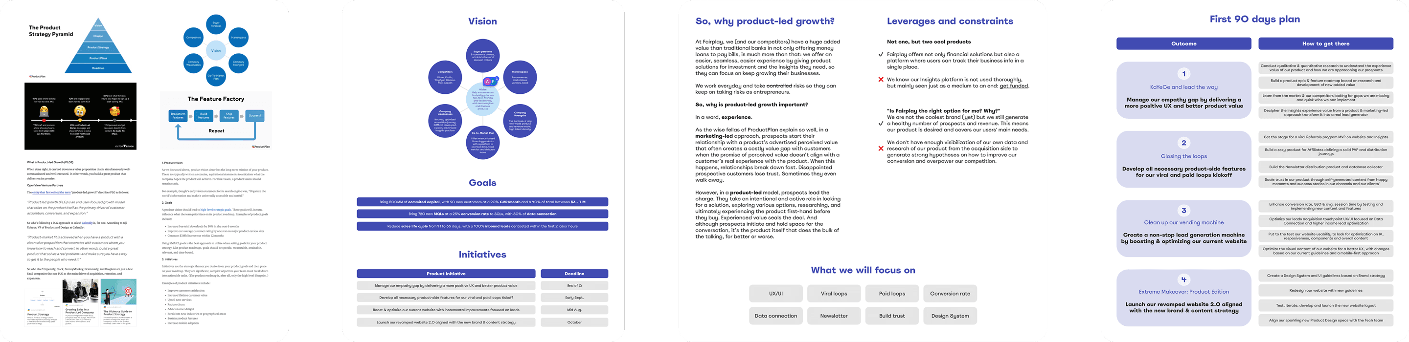
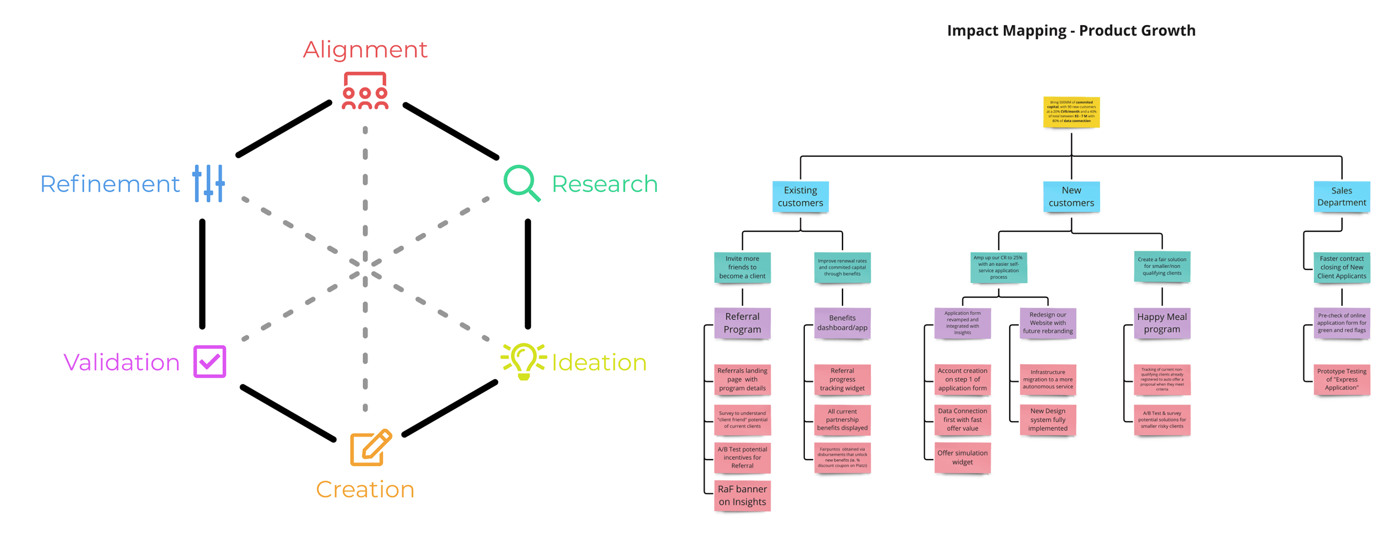
In product-led growth, real product experience — not promises — creates trust.
Process
Research & Analysis
→ Buyer Personas & Use Cases
We began with a discovery phase to deeply understand:
Fairplay’s business model
Users’ motivations and fears
The competitive landscape
We ran:
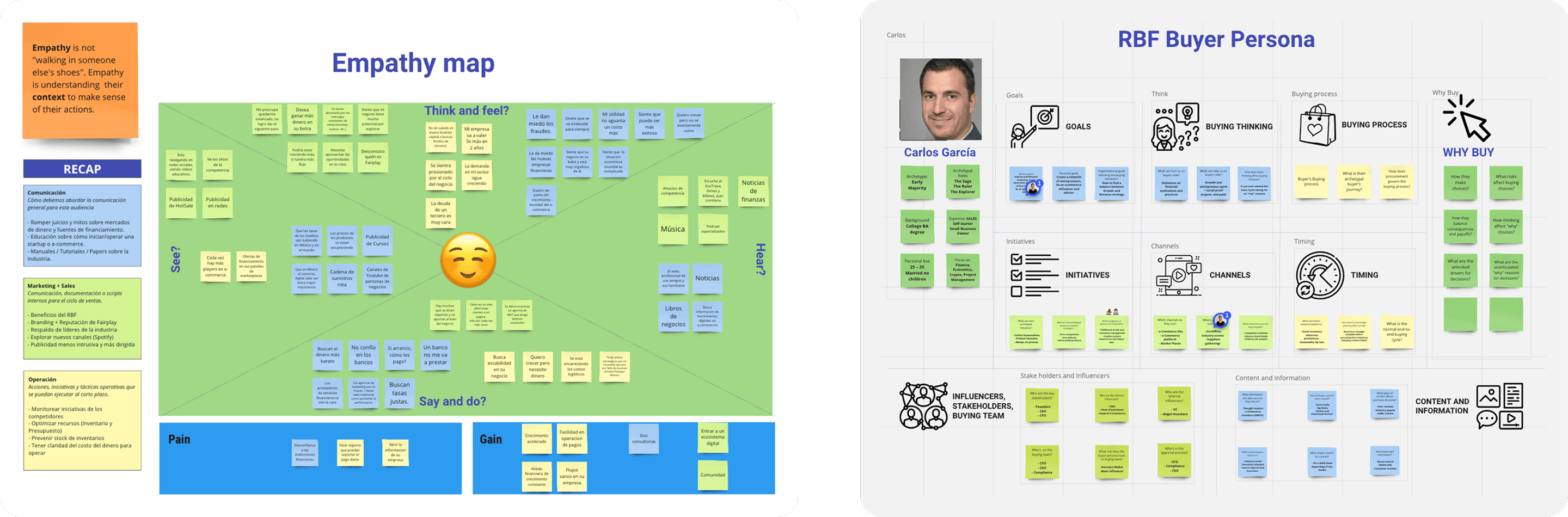
Empathy mapping workshops
Stakeholder interviews
Client interviews
Data analysis
Persona creation
Core use case modeling
This helped us understand what prospects expected, what confused them, and where the value wasn’t visible.
→ Value Proposition Audit
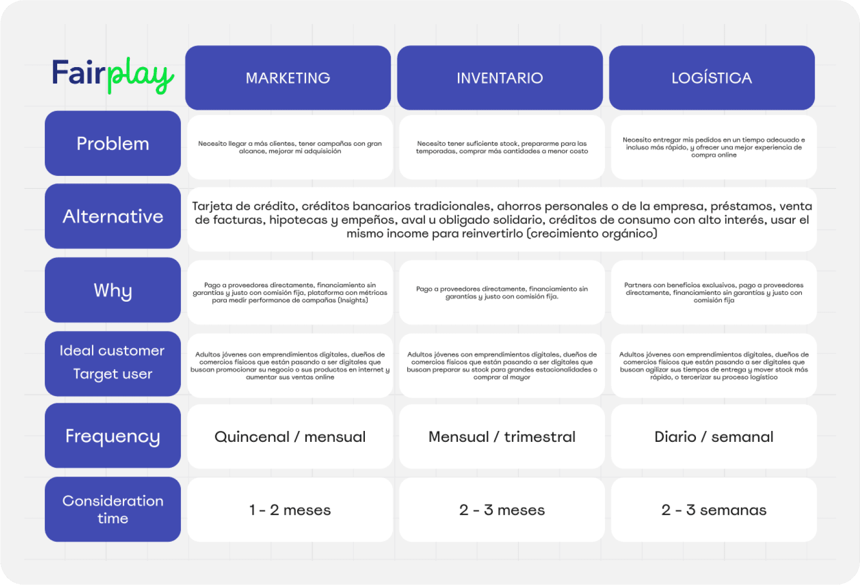
Using a Value Proposition Canvas, we aligned Fairplay’s mission with user needs.
The key finding: The website didn’t clearly connect the value of revenue-based financing to users’ real pains.
We needed to:
Communicate benefits more clearly
Reduce fear around a “non-traditional” financing model
Highlight real success stories and fairness of the model
→ Audit & Benchmark
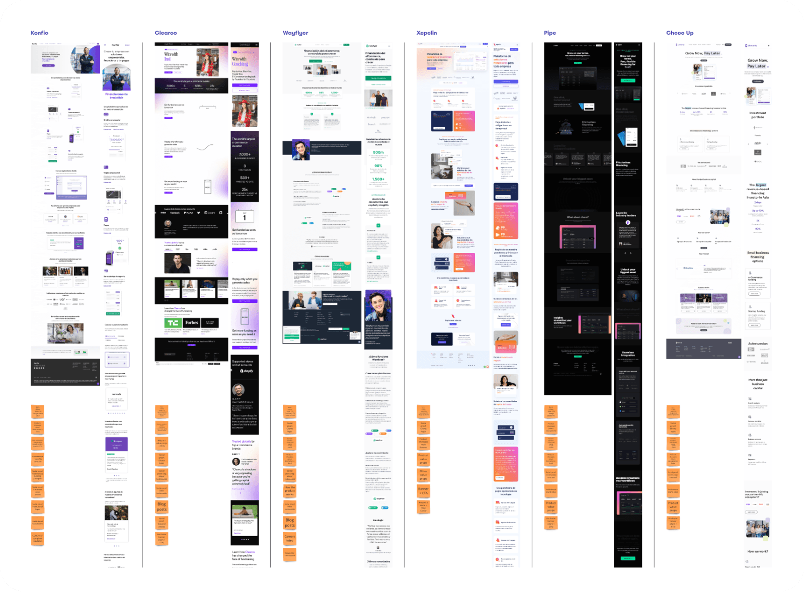
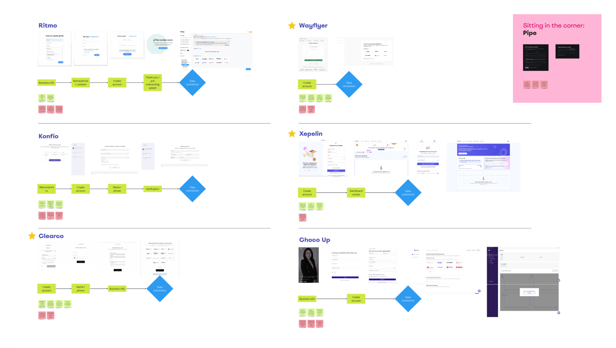
We audited the existing website and benchmarked LATAM + international competitors.
This revealed:
Cluttered navigation
Outdated visual design
Long, confusing forms
Missing trust-building elements
And also clear opportunities to differentiate Fairplay’s voice and value.
Redesigning the Experience (UX/UI)
→ Information Architecture
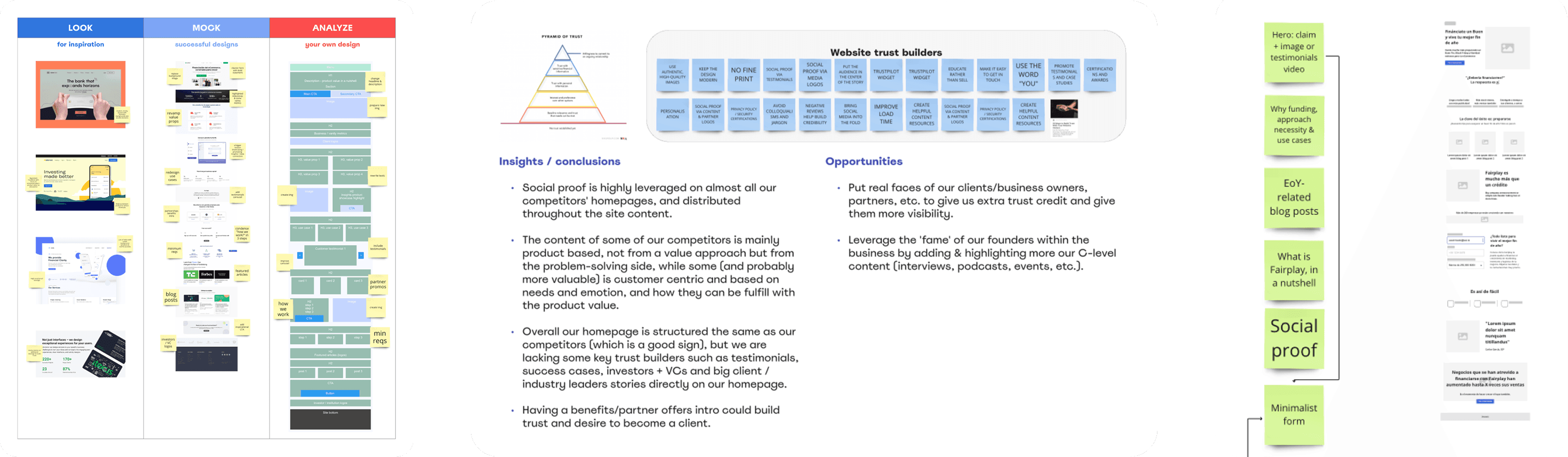
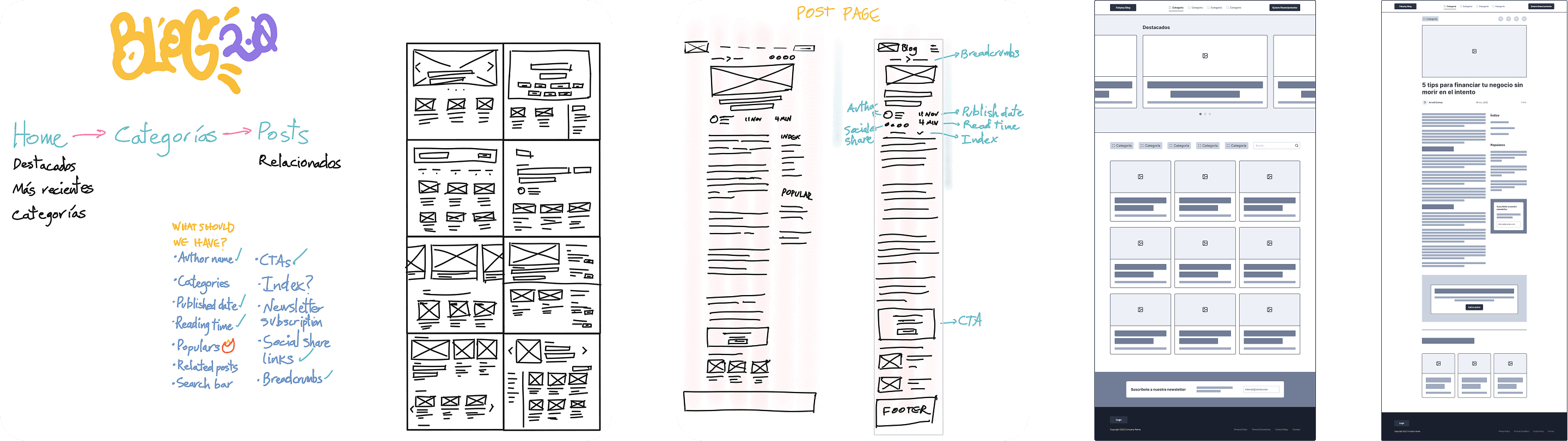
I created new low-fidelity wireframes to reorganize content around:
Trust
Clarity
A straightforward conversion path
We removed unnecessary elements and highlighted the success metrics, process clarity, and business benefits that users needed to feel confident.
→ Conversion Optimization
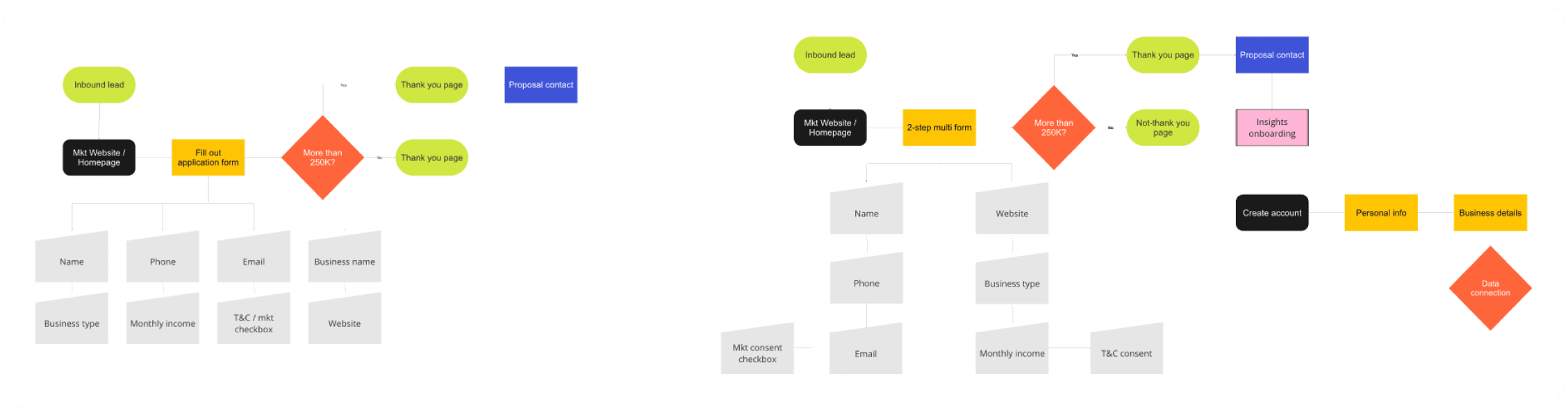
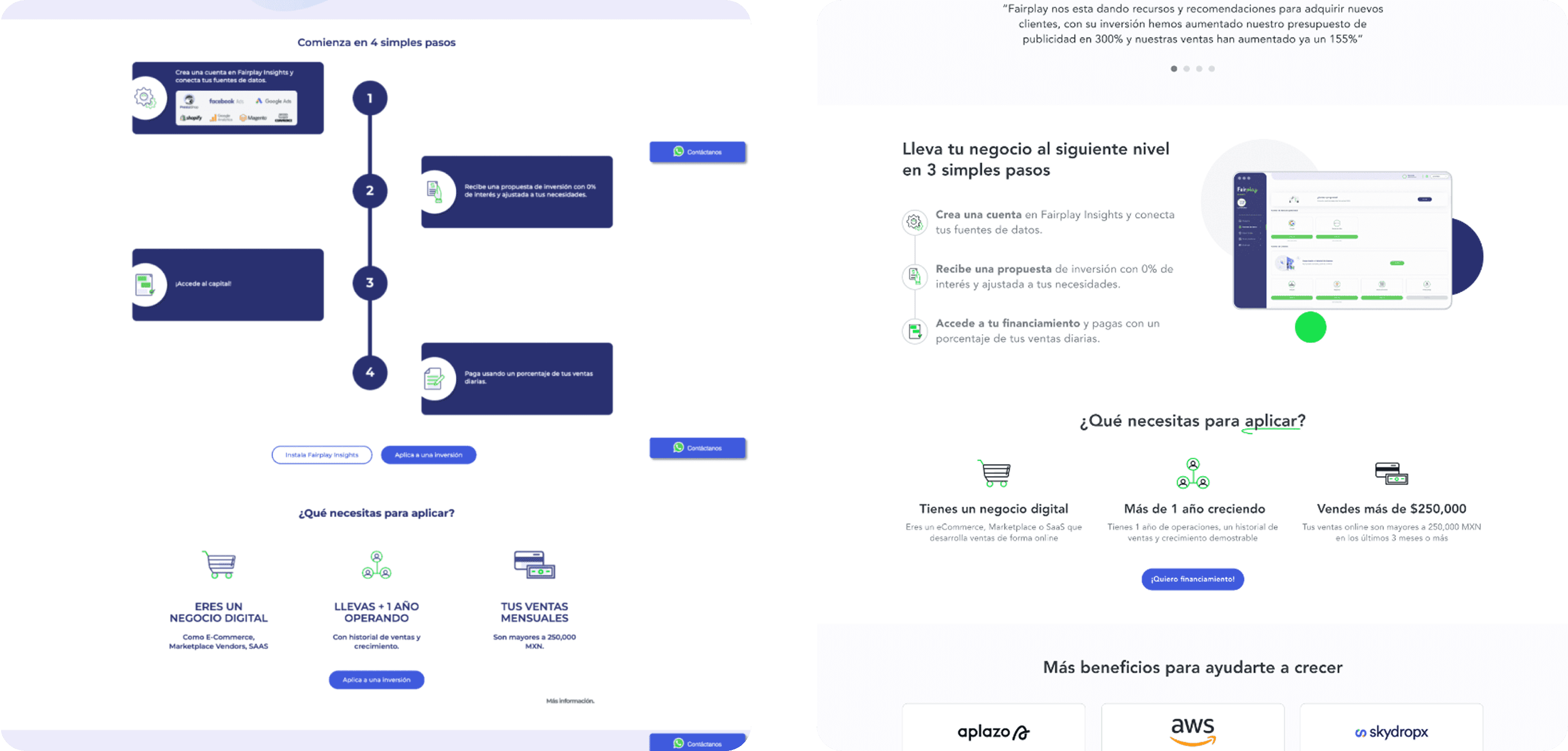
We reworked key conversion moments:
Shorter, clearer financing application forms
Stronger, more meaningful CTAs
Streamlined user journeys
A/B-tested copy and layouts
More visual cues to guide decision-making
Visual Design
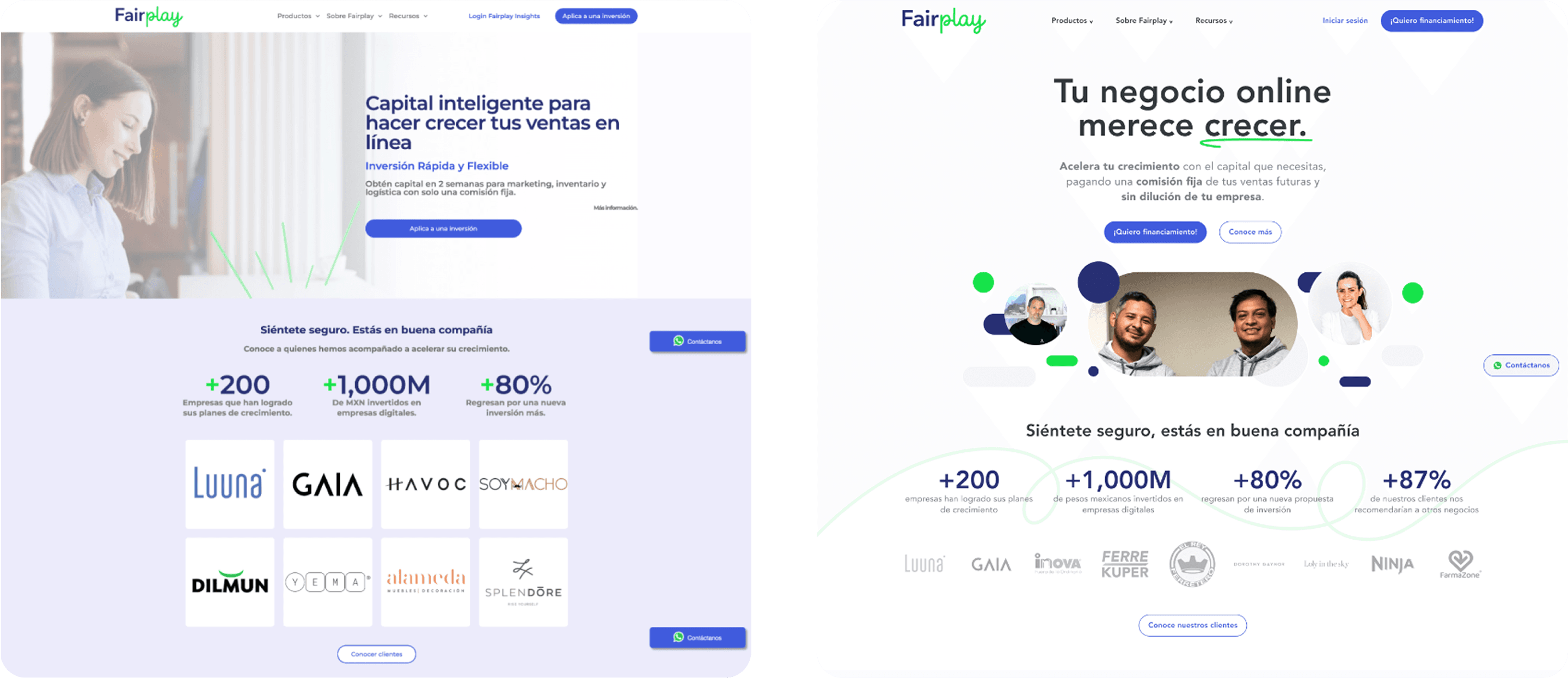
The original site felt outdated and visually inconsistent.
I refreshed the entire visual identity for the web experience:
Modernized typography
Clean, trustworthy color palette
Simplified layout
Scalable components
Clear use of space and hierarchy
The redesign aligned with Fairplay’s values of transparency, professionalism, and reliability.

Engagement & Blog Redesign
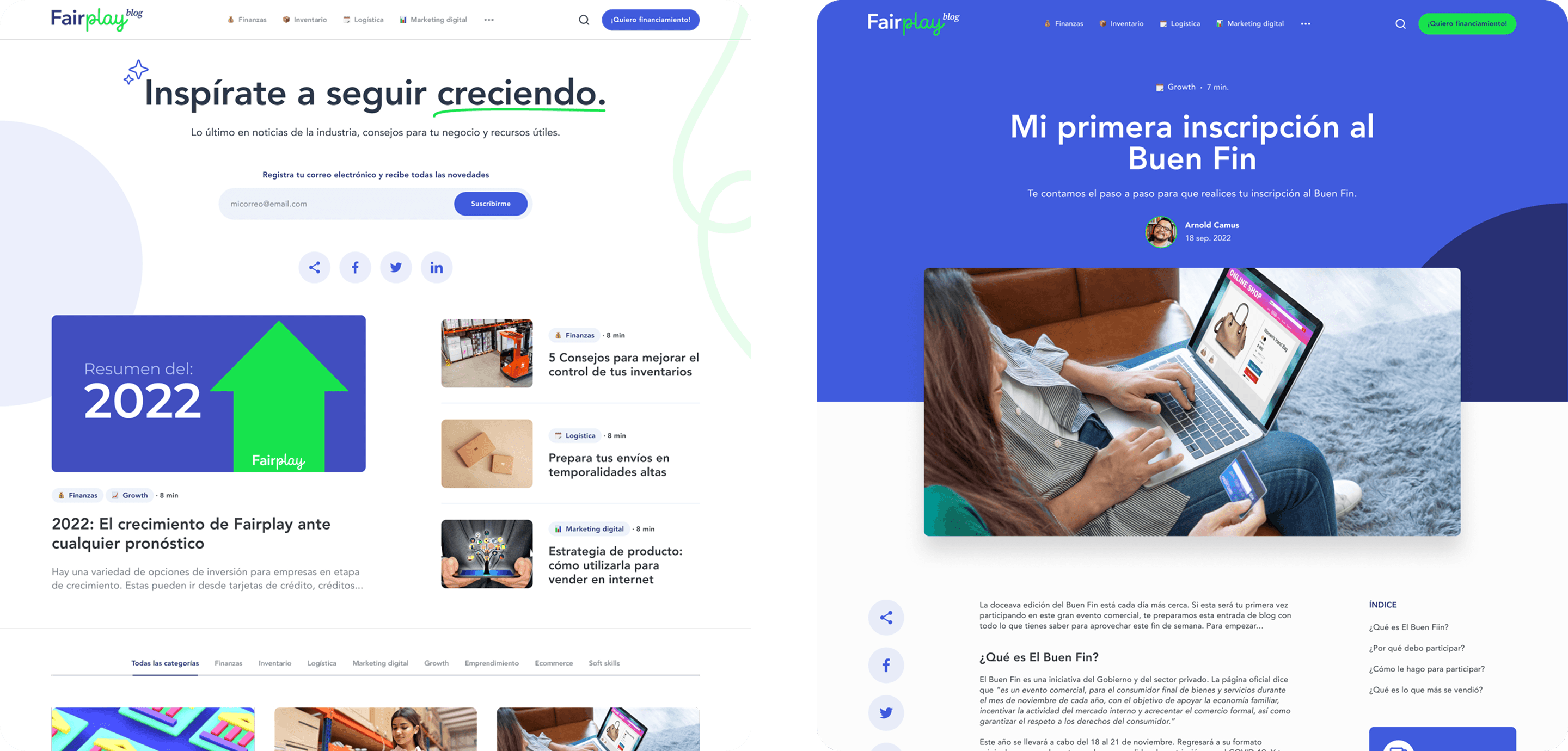
The blog was also redesigned to support:
Trust building
Education
Organic acquisition
A smoother reading experience
We created a more intuitive layout, clearer categories, and SEO-friendly content strategy around e-commerce growth, financing education, and customer success stories.
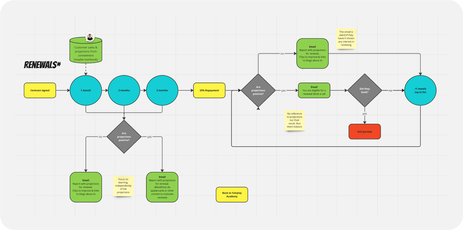
Retention Strategy
Even with strong retention metrics, we aimed to improve:
Renewal touchpoints
Personalized content for each user
Reports and notifications tailored to their financing history
Timely updates on new opportunities
The goal: keep clients engaged, informed, and confident in their long-term partnership with Fairplay.
Impact
Increased conversion — a significant boost in new prospect conversions thanks to clearer messaging, better UX patterns and a more intuitive registration flow.
Higher trust — users understood the model faster and felt more confident in taking the next step.
Better content performance — the redesigned blog saw improved engagement, longer sessions, and increased organic traffic.
Learnings
There’s always more behind the UI
A product may be functional, but UX often uncovers deeper operational, communication, and strategic issues that need alignment.
Trust is everything
A confused user won’t convert. Speaking their language without too much technical jargon is key in fintech.
The best design comes from many voices
Co-creating with non-designers brought invaluable insights and created a stronger internal alignment.
